loanDepot Home Page

PROJECT DESCRIPTION
Starting January 2025, TCPA (Telephone Consumer Protection Act) changes took place. Lead aggregators must receive explicit consent from consumers on which lenders they would like to reach them. loanDepot buys leads from these lead aggregators like Lending Tree, so optimizing the home page for our own lead generation became essential.
In addition to law changes to the industry, we went through a brand refresh at the beginning of 2024. The home page redesign allowed for a brand refresh as well as spearheading a new user experience.
UAT & SG1 HAND-OFF
UX/UI DESIGNER
PROJECT MANAGER

COMPETITOR ANALYSIS
KEY TAKEAWAYS
Reviews matter and should be high priority, especially with a source to establish brand ethos with the audience.
Simplicity is key, have a main goal you are trying to have the consumer accomplish.
Do not make it difficult to find information they came to your site for
Rocket and Better are main competitors. Their branding is simple and strong, does not distract from the desired outcome we want from our users.
MORE INSPO


NEW DESIGN

ADDITIONAL CHANGES MADE
Changed language of CTA buttons, provided more context as to which path is right for you as a user
Created more contrast in the navigation by using our brand green as a button color.
Added more contact numbers, as incorrect information was on the home page before
Removed carousel feature, but maintained a section that allows for flexible content right underneath the header section
Added a tools section, providing our online audience with beneficial tools that they can use immediately
Updated imagery to match brand refresh
Added a review section with hard-coded reviews
Deprioritized the MLB partnership callout
Many unexpected, yet expected changes were made. The brand refresh was really a 180 from what was being executed on before. While maintaining a lot of the features from the home page, we were able to provide a much more elevated and refined experience for customers.
Within the first month of launching the website, there was a 55.36% increase in engagement, 70% increase in “Apply Now” conversions, and a 70% increase in average duration. Along with no bugs or complications that had to be escalated to our dev team.
Rarely does a project go off without a hitch, let alone with this level of success! It was a great way for me to be introduced to our UX/UI designers and developers at loanDepot, and is a project I truly cherished, all the while I was getting to learn by executing.

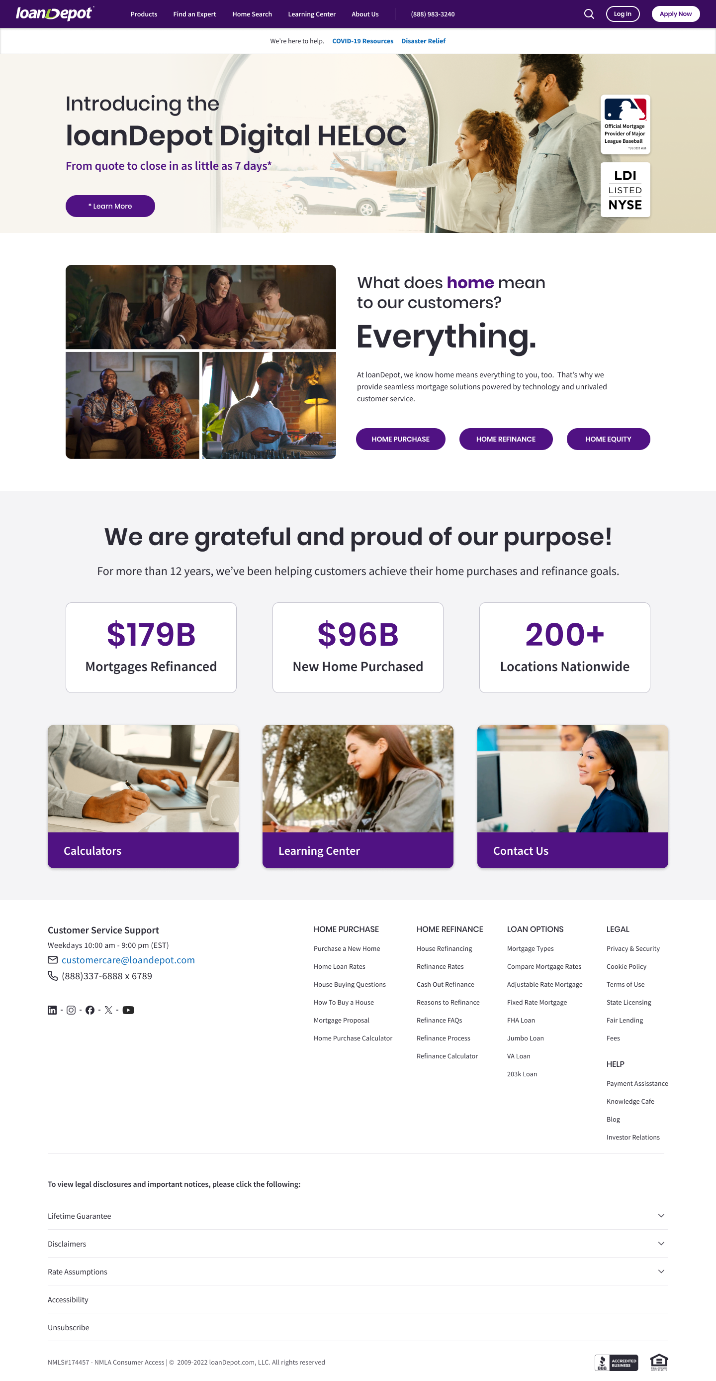
PREVIOUS DESIGN
ANALYSIS & DIRECTION FROM STAKEHOLDERS
Prioritize “Home Purchase”, “Home Refinance”, and “Home Equity” buttons on the page
Optimize the global navigation by adding contact information and updating UI
Colors, typography, and imagery needs to be updated to align with brand refresh
Deprioritize the MLB partnership
Overall, the main priority of this project is to drive our audience to enter into our own lead capture form. Starting this project also led us down the path of reskinning the flows of the application forms to better align visually with the new direction of the brand.